Tartan Literary & Arts Magazine Issue 67
| Graphic & Publication Design |
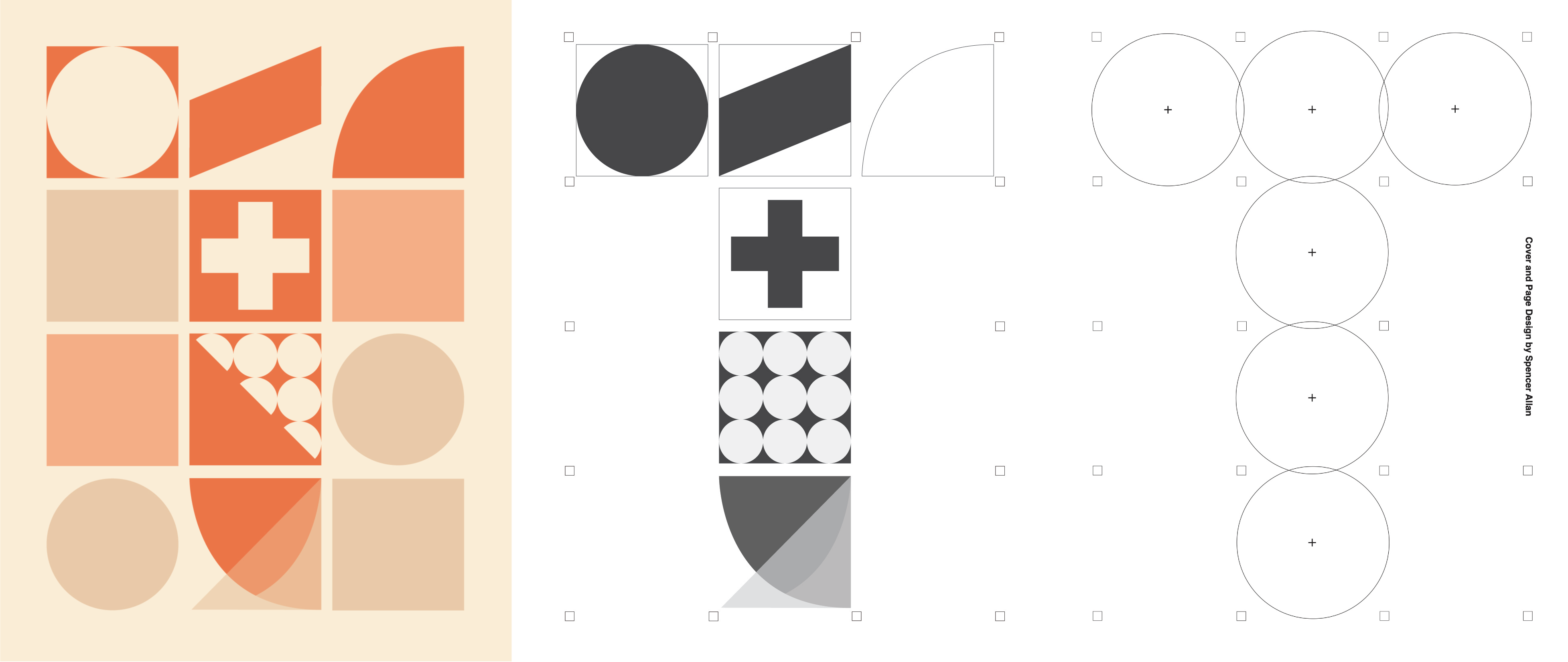
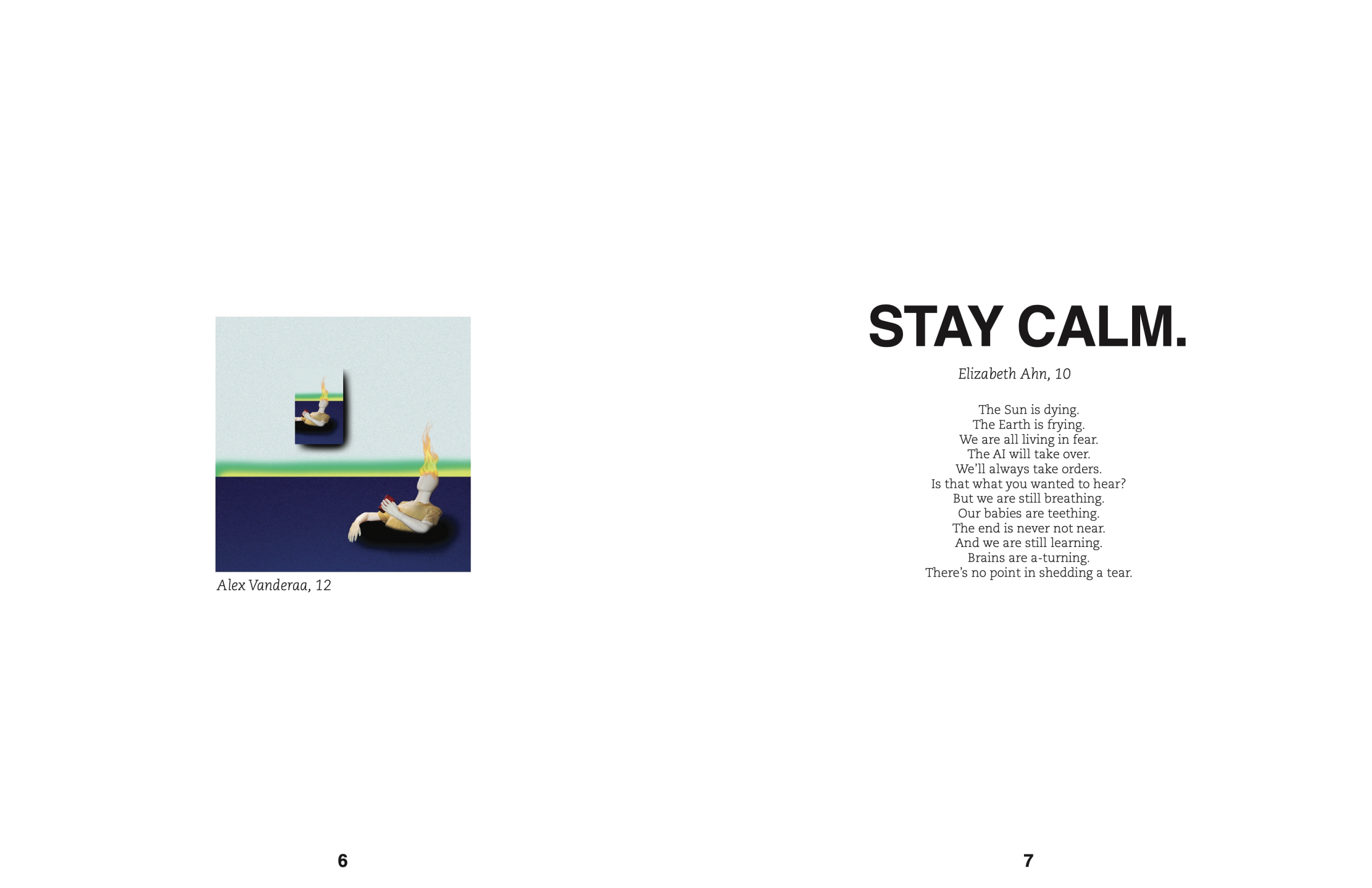
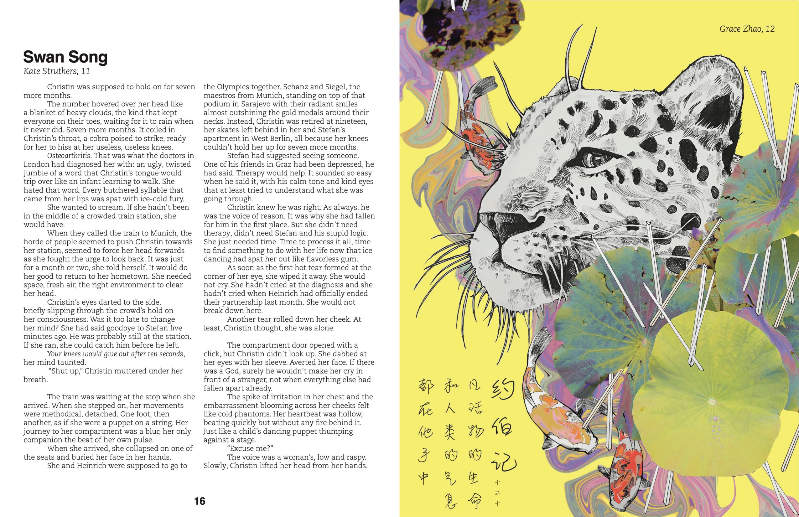
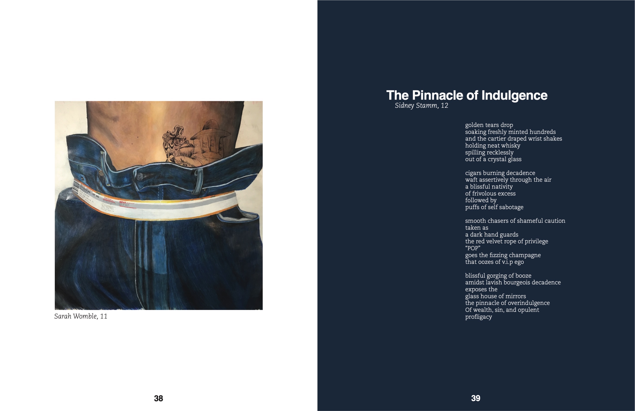
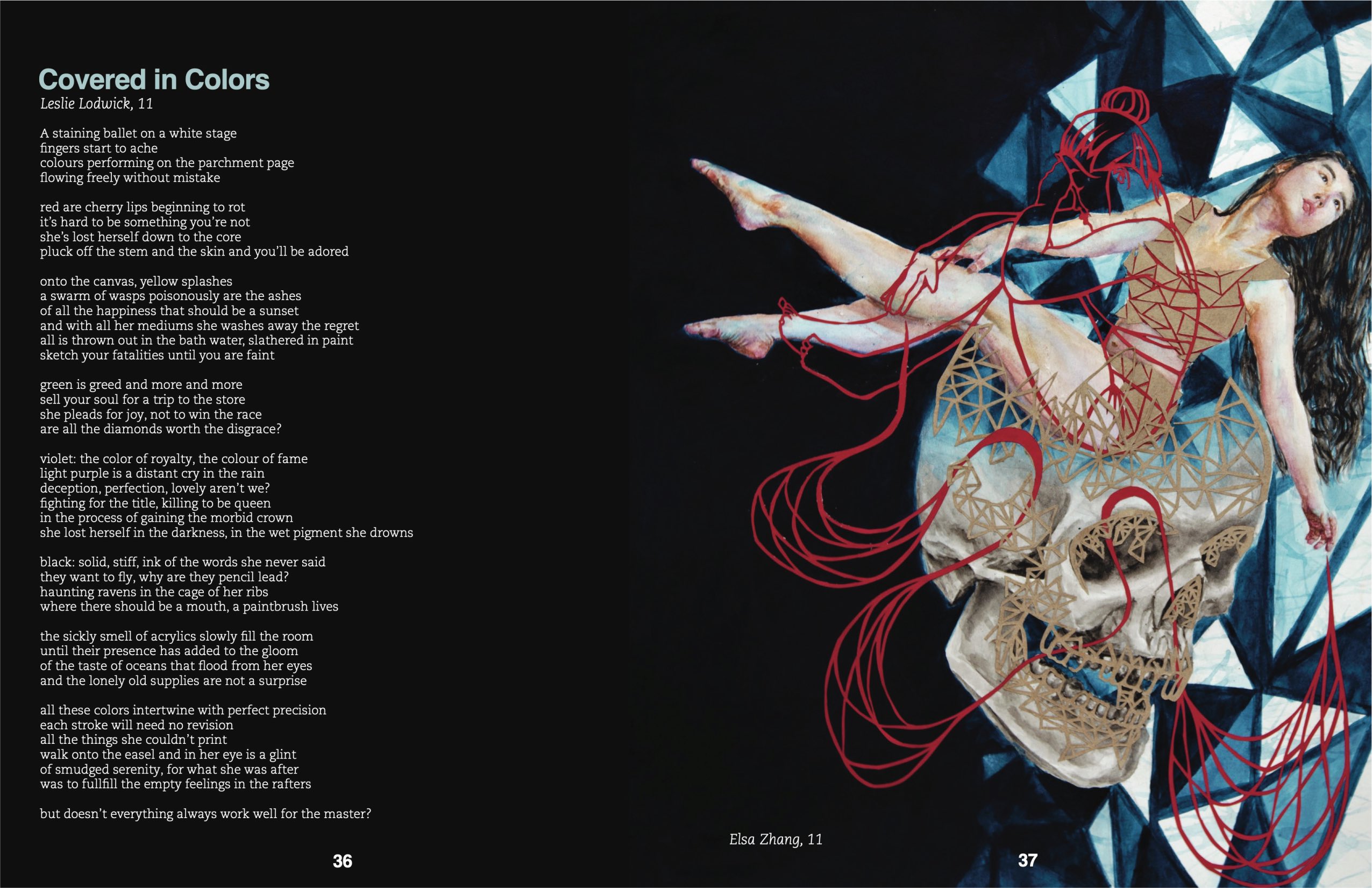
This is the third and final issue of the Tartan that I designed as Editor-in-Chief. Completed just before I moved to Chicago, I was thinking a lot at the time about transition, and that became the informal theme of the magazine. The design of the cover “deconstructs” as you flip through the magazine and there is a gradual transition in the design of the spreads from light to dark.
In this issue, art became just as much a part of the story as the writing (previous issues had been printed mostly in black and white). We pieced together visuals and text that shared a common theme or outlook, the result being an issue that touches on themes like the importance of family, the crises of self-identity, and the beauty of Planet Earth.
A month after publication, the Tartan was awarded a Silver Crown by the Columbia Scholastic Press Association, one of its highest honors bestowed, for overall excellence.
